Tuesday, June 29, 2010

Icy Blue


"Blue Skyscraper(w/crane)"
oil on panel, 2009
5" x 3.5" (12.7cm x 8.89cm)
private collection

A building in downtown LA near the end of it's construction, rising into the icy blue. This image shows the crane still in place. The yellow band at the top is part of it's construction and doesn't show after the building is finished.

Although I don't know if one was used here, sometimes you will see what is called a 'peri wall', which serves as a safety barrier for both the workers on top and pedestrians below. The wall is actually a device that climbs the outside of the skyscraper as each floor is added.

Technology is pretty amazing, and this serves as a nod to the engineers who dream this stuff up.50
Click on image for larger view

Wednesday, June 23, 2010

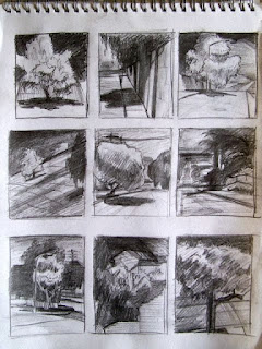
Value Thumbnails 1


Sketchbook thumbnails
pencil, 2010
page 12" x 9" (30.48cm x 22.86cm)
NSF

Here's a page of thumbnail sketches for paintings.

As I said in my post 'Imagination' it's good to work from your minds eye. It requires a different set of skills, forcing you to think differently than observation.

The purpose here is simple value studies, the distribution of lights and darks. Working out the graphic pattern first allows for a stronger composition. A foundation to build upon.49
Click on image for larger view

*Based on a comment (below, Thank you Erin) from a follower (link here), here is an update to this posting of thumbnails.
Each link will take you to paintings posted on my blog showing the finished painting from these thumbnail sketches, something that did not occur to me at the finish of each painting.


In the case of these I went from thumbnail directly to the painting since the paintings are small and needed no further preliminary work.
Some minor adjustments were made during the painting process, like switching to a horizontal format for the lower left thumbnail, adding figures to the upper left thumbnail, leaning the wall in the top row middle thumbnail, but the basic graphic pattern of the thumbnail essentially remained the same.


This is the benefit of doing quick value thumbnails. It gives me a quick visual without investing too much time, allowing me to see how strong the design is as well as decide what changes need to be made to improve the composition. As seen in the paintings, the changes made led to stronger images.


There are 3 others from the thumbnails not yet posted to blog. I will add them to this update as they are posted.


Links to paintings from thumbnails:
Bottom row left thumbnail
Top row left thumbnail
Top row middle thumbnail
Top row right thumbnail
Middle row middle thumbnail


Sunday, June 20, 2010

Periscopes


"Approach to Gerald Desmond Bridge"
oil on panel, 2009
3.5" x 5" (8.89cm x 12.7cm)
private collection

A bridge in the LA Harbor. I like this view, late in the day, for it's dark blue, almost black, approach. The bridge itself has an almost jewel-like appearance with it's perforated silhouette against the golden sky.

I also choose this over a more uninterrupted but typical view because the light poles punch into the sky like periscopes from a submarine. Their different orientations giving them an anthropomorphic manner, as though they are looking around. A common sight in industrial/machinery subjects if you're paying attention.

This is what I see and what I look for when searching for image subjects. Something slightly different. Now the painting is not solely about the bridge.48
Click on image for larger view

Friday, June 18, 2010

Short-lived


"Nocturne-Fireworks"    SOLD
oil on panel, 2009
8" x 10" (20.32cm x 25.4cm)

A quick study, broadly painted. In this case the only light is from the fireworks instead of the moon or a streetlight.

This stretches out the shadows and adds drama to the flickering, dancing light. Its harder edges and angular abstract light patterns give the image an artificiality appropriate to the short-lived subject.
It's only a matter of time before the pitch black closes in.47
Click on image for larger view

Saturday, June 12, 2010

Duo Portraits


"Duane"
oil on panel, 2007
10" x 8" (25.4cm x 20.32)
private collection


"Megan"
oil on panel, 2007
10" x 8" (25.4cm x 20.32cm)
private collection

Here's two portraits I did as a wedding gift to the couple seen here.

Keeping in mind the intent of the portraits, that each was meant for the other, I made sure to choose reference where there was eye contact. And for a more personal image, using a tight cropping.

Megan was done from a photo taken by Duane, so it has a specific memory attached to it for him. After looking through several photos of Duane I selected this one for it's more emotional resonance.45,46
Click on images for larger view

Tuesday, June 8, 2010

Jarring


"Storage Yard Nocturne"   SOLD
oil on panel, 2010
5"x 7" (12.7cm x 17.78cm)
Horizon Fine Art Gallery

Industrial nocturne, just after a rain. Combining four of my favorite image elements or subjects; the nocturne, the industrial, rain, and a simple composition.

Much like I said in my post 'Of the Night' / "Nocturne-Lucy(Cat)", the simple image can be tricky. It needs to have something to hold your attention, some quality that stirs up memories, emotions, some drama... anything to prevent it from being boring.

Here a crisp cool night, a dark blue clearing sky, the scene soaked in the yellow sodium street light, the slick wet textured street, the harder lines of the foreground offset by the lingering fog.

Dangerously close to being too simple, the power pole, dissecting the composition just off center was needed to provide a jarring effect. Without it or the lit up electrical box at the far right the image isn't as compelling to me. Hopefully this painting is provocative to others in some way, so that the industrial motif is secondary.44
Click on image for larger view

Saturday, June 5, 2010

Gritty


"Stack of Shipping Containers (w/ Sulfur Pile)"
oil on panel, 2009
3.5" x 5" (8.89cm x 12.7cm)
For Sale at Daily Paintworks, CLICK HERE

Painting small quick studies allows for experimenting without the time commitment should it not work out. Without regret, I have wiped away many failed attempts working at smaller sizes.

This oil shows a break from my usual palette. Using more black interspersed through-out gives it a more gritty look. Blurring the foreground to add some movement and indicating or suggesting forms rather than clearly delineating them for a more ambiguous effect.43
Click on image for larger view

Friday, June 4, 2010

Imagination


"Figure from Back-Reclining"    SOLD
oil on board, 2009
15" x 20" (38.1cm x 50.8cm)

Here's a figure study done recently, but without benefit of a model. Sometimes I will work from a previous drawing or do thumbnail sketches until I find something I want to work up in paint.

Even though it is better most of the time to have some kind of reference it's good to challenge yourself from time to time by working from your imagination. Many artist occupations require working this way since posing a model in true action poses, for instance, is almost impossible. Automotive designers are another example... there is no reference for what hasn't been done yet. And their designs must actually be built.

Either way, using your imagination uses a different set of skills than direct observation or working from a photo. I don't even want to lay any claims about which way is better, only that each is different and has it's own pros and cons. I will go so far as to say that working in one method helps improve the others. So that each time I work from direct observation it also strengthens my visualization skills or helps in 'deciphering' photo reference later. And though it may not seem so, working from imagination even helps improve working from a model, it teaches me to not always be so literal. They are just different disciplines.42
Click on image for larger view

Wednesday, June 2, 2010

Bleached White Sky


"Oil Plant Roof Detail"
watercolor on paper, 2010
9" x 12" (22.86cm x 30.48cm)
For Sale at Daily Paintworks, CLICK HERE

Like my previous post, this subject is utility over beauty. Or at least inherent beauty.

So in this painting my concerns were about color and design.

A limited palette of mostly blue and brown with touches of grey and black.
Backlit and a bleached white sky helped give this image the contrast needed for a more abstract composition.
The cooler, darker blue and black provide a solidity for the heavy forms, but it's the accents of burnt sienna, the warmer blue in the vertical shadows and the light blue strip across the bottom that give the image some life.41
Click on image for larger view

Tuesday, June 1, 2010

Utilitarian


"Refinery, Power Poles, Saw Horse"    SOLD
watercolor on paper, 2009
9" x 12" (22.86cm x 30.48cm)

This, in keeping with the last two posts, is to show some of my watercolors, another medium other than oil.

What drew me to this view was how it exemplified the utilitarian nature of the industrial subject. Nothing is there without serving or having served some purpose. Even in other images that may show the discarded, the forgotten, the untended, most everything in industry was created to execute a specific task or duty. No matter how mundane.

And while that may also be said about city, urban and nature subjects, these three more often are a blend of utility and aesthetics.

It is worth pointing out that there is plenty in industry that does have aesthetic concerns... automotive design, environmental design, architecture etc., but this painting is an example of function without aesthetics playing a direct role.

So aesthetics, if any, lies with how it is presented by the artist. A reflection of what the artist sees. Like so many still life artists that celebrate the common and the mundane, I felt this view was worthy of a look.

Not a glorious subject, not even a beautiful subject, but I am always struck by the similarities between refineries and cathedrals, their stacks and spires respectively, anchored in the heavy mass of their bases, piercing the skyline. Their ornate detail breaking up and sub-dividing their mass. That, for me, is compelling enough to show on it's own. That is what I see. Why not look at a subject out of context?

But as I said, I'm not looking to glorify the refinery here, so including the saw horse, power poles, and signs serve both as compositional devices to break up and fragment the picture plane and as reminders of their unsung status.40
Click on image to enlarge