"Industrial Terrain 2" work in progress
watercolor on paper
9" x 15" (22.86cm x 38.1cm)
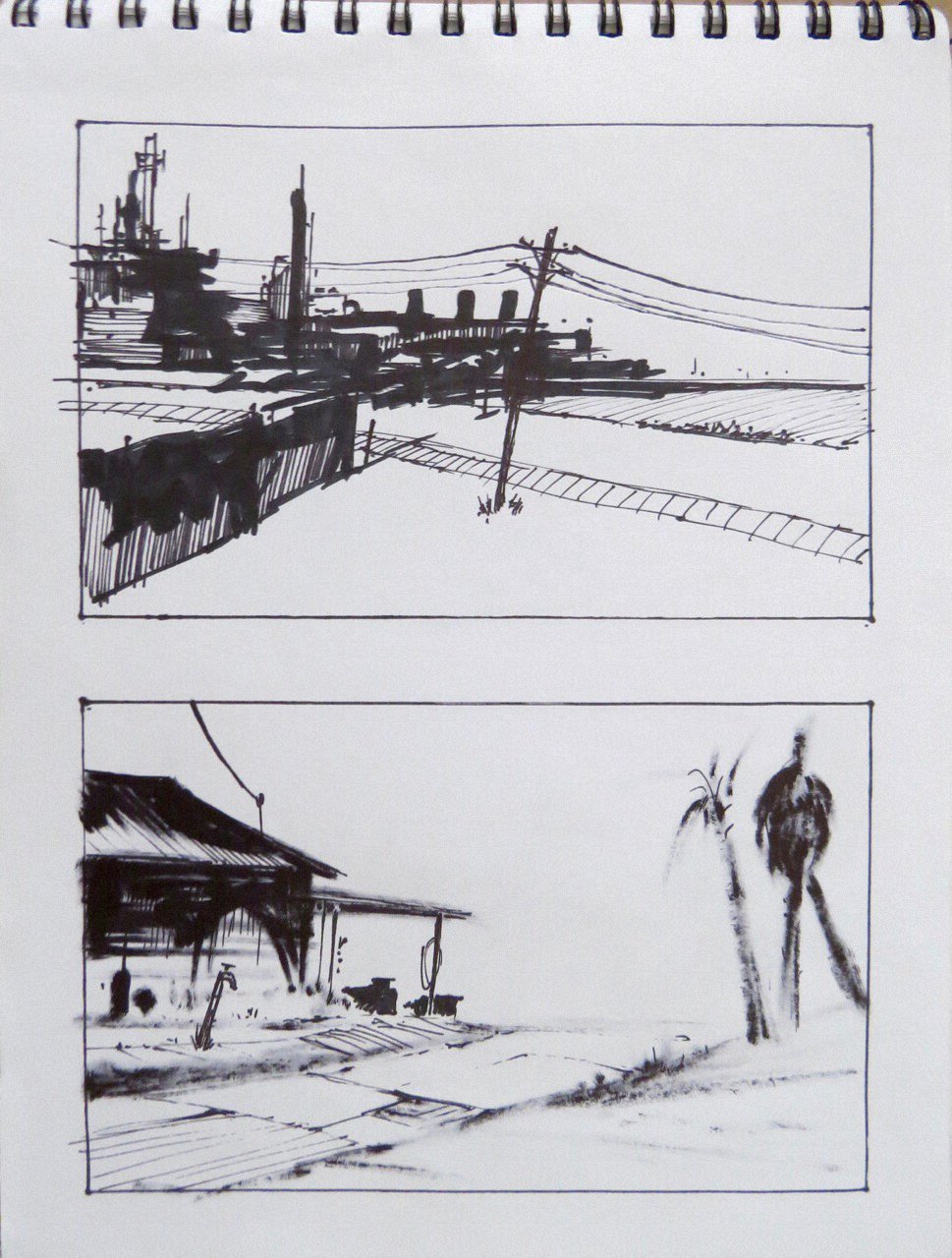
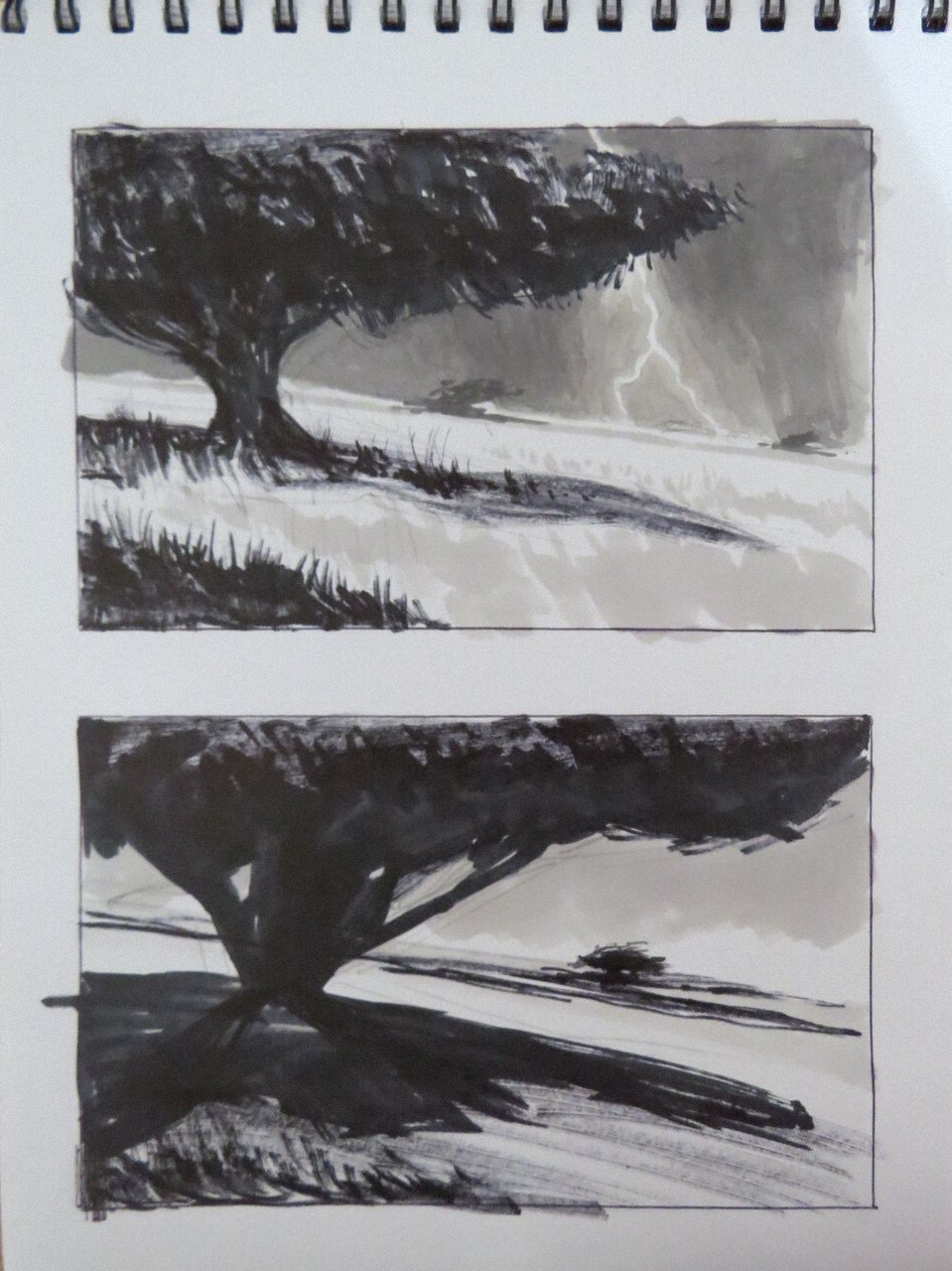
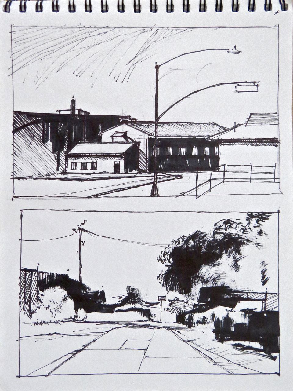
Sketchbook Drawings
Sharpie markers, Magnum, king size, fine point, ultra fine point, 2017-18
sketchbook 6" x 8" (15.24cm x 20.32cm)
Here are a couple pics from a recent watercolor demo at the South Bay Watercolor Society in Torrance California.
I was invited by another National Watercolor Society member and gallery director Louisa McHugh who also provided the demo photos. Thank you Louisa!
I decided to do the demo from one of my
marker sketches. If you are familiar with pasts posts on these marker sketches you know that most are from my imagination. I draw in marker because it is immediate and it forces me to use the design skills I know instead of interpretive skills you use while drawing from life or a 2d source. It also helps that I have done so many industrial paintings so I am familiar with how they look.
Since my watercolor process is relatively slow and demos are short I came in with the lay-in and first few washes painted. I knew I would not necessarily end with a finished painting so I spent the time talking about my process, my influences, how I arrive at a finished watercolor and answering questions while I painted.
I also had some examples of other watercolors done from these marker sketches, finished and in progress and several of the marker sketch books on hand.
The posted painting here is the state of finish I had at the end of the demo. I managed to get it past the really 'ugly stage' that all my watercolors go through. You know how some watercolorists have beautiful paintings at every step? Not mine!
I have never like my watercolors early in the painting. The first two-thirds is so awful to look at and if I didn't know better I would never finish one! I just know to stay with it to the end.
When I finish this one I will post it.