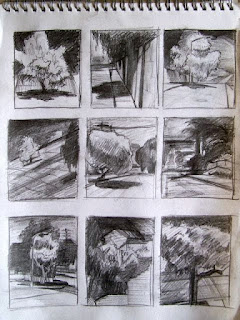
Sketchbook thumbnails
pencil, 2010
page 12" x 9" (30.48cm x 22.86cm)
NSF
NSF
Here's a page of thumbnail sketches for paintings.
As I said in my post 'Imagination' it's good to work from your minds eye. It requires a different set of skills, forcing you to think differently than observation.
The purpose here is simple value studies, the distribution of lights and darks. Working out the graphic pattern first allows for a stronger composition. A foundation to build upon.49
Click on image for larger view
*Based on a comment (below, Thank you Erin) from a follower (link here), here is an update to this posting of thumbnails.
Each link will take you to paintings posted on my blog showing the finished painting from these thumbnail sketches, something that did not occur to me at the finish of each painting.
In the case of these I went from thumbnail directly to the painting since the paintings are small and needed no further preliminary work.
Some minor adjustments were made during the painting process, like switching to a horizontal format for the lower left thumbnail, adding figures to the upper left thumbnail, leaning the wall in the top row middle thumbnail, but the basic graphic pattern of the thumbnail essentially remained the same.
This is the benefit of doing quick value thumbnails. It gives me a quick visual without investing too much time, allowing me to see how strong the design is as well as decide what changes need to be made to improve the composition. As seen in the paintings, the changes made led to stronger images.
There are 3 others from the thumbnails not yet posted to blog. I will add them to this update as they are posted.
Links to paintings from thumbnails:
Bottom row left thumbnail
Top row left thumbnail
Top row middle thumbnail
Top row right thumbnail
Middle row middle thumbnail


I've included a link to this page in a post I've been writing about planning a linocut I am working on. :) Thanks for sharing your work!
ReplyDeleteThan you Erin for the link and for becoming a follower of my blog. I always appreciate interest from other artists.
ReplyDeleteLet me know when your post is complete. I would like to read it and see your linocut when it's complete.