Friday, October 28, 2011

Burnscapes - Man vs Nature

"Burnscape #4 (Charred Pine Stand)"

"Burnscape #8 (Charred Cactus)"


"Burnscape #4 (Charred Pine Stand)"
watercolor on paper, 2011
6" x 8" (15.24cm x 20.32cm)


"Burnscape #8 (Charred Cactus)"
watercolor, Pelikan india ink on paper, 2011
6" x 8" (15.24cm x 20.32cm)


Here are two recent watercolor/mixed media's from my Burnscape series. Both were at my solo show at the Randy Higbee Gallery. See previous posts.

Living in Southern California and seeing so many wildfires it would be easy to focus on the destruction. My attraction for the burned landscape isn't for its destruction... but instead how it modifies the landscape, turning it into a charcoal terrain... it is rebirth, the way Mother Nature intended.
It is how She manages her jurisdiction, by controlling dense undergrowth. We usually get in the way.
Man has traditionally prevented fires, the growth becoming so thick that when fire does occur it is devastating. Another topic on the Man vs Nature theme.

Top - #4 Trees are meant to survive fires where brush is low to the ground, the fire sweeping through too quickly (and frequently enough) to wipe them out. This pine stand didn't look like it would survive so to accentuate this I set its blackened silhouette against a background of unburned green.

Bottom - #8 As fire sweeps through dry brush, here... all that's left of a thicket, sometimes all that is left behind is high water content vegetation like cactus. What caught my attention was how the left side of the cactus clump seemed to have leaned away from the fire.137,138

Click on image for larger view

Wednesday, October 26, 2011

Harbor Line - Bridge Shadow


"Pacific Harbor Line 20 (Bridge Shadow)"    SOLD
oil on panel, 2011
5" x 7" (12.7cm x 17.78cm)

The Pacific Harbor Line, the workhorse of the LA  Harbor. This newer one is part of the low emission line of locomotives for the move towards a greener port. Black and shiny as tar with striking graphics, they don't blend in, they stand out. Not graceful looking, they look like they mean business. The back end diagonals point down, the front point up to distinguish front from rear when seen head on. Its side panel graphics angling forward. So a nod of beautiful work to the designers of these burly beasts of burden.

My Pacific Harbor Line series. This one, the #20, is a remote control locomotive and is often parked here near the base of the Vincent Thomas Bridge.
Here it sits in the afternoon at the shadow of the Vincent Thomas Bridge as the marine layer begins to settle in over the port.136

Click on image for larger view

Saturday, October 22, 2011

Matrix 2


"Power Plant Interior #2"
oil on panel, 2011
5" x 7" (12.7cm x 17.78cm)

Here is another view of the power plant interior, the first here and a drawing here.
I could do dozens of these and not tire of it, even slightly different views. In fact I have a larger 24" x 30" in progress. I love the limited palette of muted ochre/yellow and sienna, with punctuations of earthy greens and reds.

One of the most fascinating buildings...several stories high...the interior nearly wide open... a matrix of pipes, valves, steel... deep and cavernous.

The light and colors seen here are faithful to the actual site...the walls and pipes painted in these ochres and creams, the floors a mixture of reds and greens, worn and distressed...deep earthy orange reflected light, then the translucent glass filters the outside light...a cool pale yellow.135

Click on image for larger view

Tuesday, October 18, 2011

Vincent Thomas Bridge #5 - Color study


"Vincent Thomas Bridge #5 - Color Study"
oil on panel, 2011
9" x 6" (22.86cm x 15.24cm)
For Sale at Daily Paintworks, CLICK HERE

Here is another version, in oil, of the watercolor / gouache study from an earlier post.

On this one I experimented with a different color and value scheme to cut back the amount of lime green that shows in full sunlight. Throwing a soft shadow across part of the bridge allowed for multiple greens, from the lime green it shows in bright light to its signature chrome green and into a deep bluer green. The roadway a chocolate brown, the foreground structure a warm olive green.
Doing that also changes the design of the value distibution. With the towers in light and shadow a stronger more dramatic composition is achieved.134

Thursday, October 13, 2011

777- Google's 7 Dynamic views

The Seven Dwarfs, The Seven Samuri...
and now Google has introduced 7 new different ways to view blogs.
And while they are still working on it to allow for better customizations, blogs can still be viewed in them without switching the template over. Click link below to view Avid Art in any of the seven Dynamic views starting with Flipcard. Each has its own characteristics. 


http://davidteterart.blogspot.com/view/flipcard


You can also at any time click the link 'Google Dynamic Views' in the right hand column at top.


Flip card is best for seeing all images currently on blog at once and allows for sorting by Recent, Date, Label, and Author.
One of the best features all share is infinite scrolling, no clicking older or newer posts.
No matter where you are in scrolling you can access the drop down menu by edging the pointer just over the black line under the title.
Hover over the arrow next to Flipcard to see others.
Have fun with it.
Click on blog title 'Avid Art' to return to this template.


PS- I'm not sure why some images do not appear in Flipcard and Mosaic. But the image is still there to click. On others, images are missing, maybe a result of this being a preview and not a selected template.
Also there seems to be some spacing issues in the translation.

Wednesday, October 12, 2011

Problem Solving- "Vincent Thomas Bridge #4"


"Vincent Thomas Bridge #4 - Catalina Express"    SOLD
watercolor on illustration board, 2011
11.75" x 8" (29.845cm x 20.32cm)


Here is a fairly common view of bridges. But a good one because there is a great sense of height when seen from the ground from underneath.

This is the finished painting of one I posted (here) back in March as a work in progress. One intended for my October Show.
It was one of those that at the beginning I had a clear vision of what I was going to do and how it would look. A quick painting, in a method I had done many times. I like those, they are fun and satisfying.

Then about halfway through I realized (OH NO!) it isn't working... it was just sort of dying right in front of me. So much for fun and satisfaction. This one is going to battle me. Should I panic? No... not really my style.

Problem solve, no problem. Think fundamentals, that is where most trouble lies. It's not the flooring, the curtains, the sofa etc., no, no, no... its the foundation, the framing or the roof. No point moving forward till I figure it out or I'm in for some wasted time.
Most of the time I know what to do... that is to 'let it go' and keep painting, keep forging ahead. Not this time, I sat back and stared at it and for the life of me I had no idea where it was failing. Ok, it's only half way done I thought soooo... start checking... the drawing or perspective of it really isn't off, maybe a little, but thats not it, those kinds of minor corrections take place as I refine the painting, working to the end.

It's too premature to really judge the color, or more specific... color relationships. If everything else is working; design, values etc, then color is usually secondary.
The point of view? nooo... god forbid otherwise the whole thing gets scrapped. Bad choices you can't fix.

The composition? ... uh... maybe... shoot, that would mean significant changes.
Forget texture or detail or surface... technique, these are usually more superficial, usually not the make or break of an image, more along the line of the refinements/corrections, at least the way I work.

I don't always know where things went wrong, right away, but I know WHAT TO DO.
That is to STOP looking at it. Put it away, turn it around, don't think about it, work on something else. Come back later for a fresh look.

So thats what I did. I came back to it, (more than once I might add), with a fresh eye...then it hit me! like a ton of bricks! It's lifeless! Stupid thing! Duh! I remember thinking  " ...it's dying right in front of me" the opposite of life, how did I miss the connection?
OK! Now what? Give it some life.

Sometimes, fundamentals or not, if I have an image that starts slipping away it unconsciously affects my enthusiasm and I start to lose interest which shows in the painting. The sooner I identify that the better. Then surprisingly few changes need to made.
  • Start by introducing the warmer tones in the sky, it's far too cold in color temperature. 
  • Too much residual green from my initial lay in, the early washes, substitute blues in place of greens.
  • Break up the silhouette and soften edges. I was going for a strong graphic pattern from the start but now that I see it, it's too rigid, even for a bridge.
  • Extend the foreground a bit, it's too slight to visually support the bridge
Whew! It wasn't that far off... looks like I won... HA, HA, HA,   it did not defeat me this time.133

Click on image for larger view

Monday, October 10, 2011

Vincent Thomas Bridge #8 Containment 1


"Vincent Thomas Bridge #8 (Containment 1)"
oil on panel, 2011
5" x 7" (12.7cm x 17.78cm)

Bridges carry a certain civic pride much like state and country pride.Their primary function may be utilitarian but for locals they are a source of identity.

This painting also overlaps into my containment series, a series on modern construction techniques. These days everything gets wrapped in heavy plastic or tarps to contain the work, a sort of cocoon, keeping dust from contaminating the environment.

Twenty or thirty years ago it was not done and open construction was more prevalent. Modern green thinking has changed our approach to not only recycling but how we do  everything. This painting shows the painting of the underside in progress.

A broad view of the containment area shows all of the working tools and materials needed to paint the bridge.
A platform is hung underneath then everything is wrapped in plastic; wall, floors & suspension hooks. Nothing allowed to escape into the environment.133

Click on image for larger view

Thursday, October 6, 2011

'Lines and Colors'

I am happy to announce and thrilled that Charley Parker over at 'Lines and Colors' has done a post on my work here.
I have followed his blog for some time and it is a great place to discover artists, both past and present, as well as museum websites, art related events, products etc.

Be sure to check out his other websites on the left hand side under 'My other sites' as he also does website design, comics, iPod and iPhone apps and cool dinosaur stuff.

Thank you Charley!

"Vincent Thomas Bridge #13"


"Vincent Thomas Bridge #13"    SOLD
oil on panel, 2011
7" x 5" (17.78cm x 12.7cm)

Bridges carry a certain civic pride much like state and country pride.
Their primary function may be utilitarian but for locals they are a source of identity.

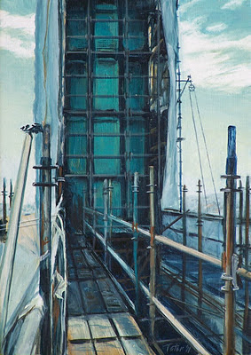
A bright day and back lit, a close-up of one of the towers partially unwrapped, the painting recently completed. A small pulley is used to haul up tools and materials from a platform below that extends out from under the bridge roadway.132

Click on image for larger view

Tuesday, October 4, 2011

One Man Show Opening - Randy Higbee Gallery

Me and Jennifer Teter-Mitchell
just before the show opened


Artist Wendy Wirth and Me


The opening night of my One Man Show at the Randy Higbee Gallery looked fabulous.
The highly professional presentation is the norm for the Gallery but is never as easy as it appears. It is achieved through lots of hard work by the entire staff there; from the framing to the hanging, the advertising and right down to the little finishing touches. All done with smiles and enthusiasm.

Here are some iPhone pics of the opening night. I'll post more pics soon. Here's a link to more art in the show, which will hang until October 15th.

Here at Avid Art, before it even becomes a show, there is the same hard work happening behind the scenes.
Jennifer Teter-Mitchell, who handles all the marketing and graphic design at Avid Art, deliveries, ephemeral material and far too many little but equally important tasks was tireless.
And Susan Laumen, who handles all the accounting, inventory, and archiving documentation, typing and the same... multitudes of minor details, was also tireless right up to the end.

None of us can do it alone, it requires a concentrated effort by too many people to mention individually.
So I thank every person in helping to make the show a success.

Monday, October 3, 2011

One Man Show - Seascape


"Seascape #5 (Rock Outcrop)"   SOLD
oil on canvas, 2011
24" x 36" (60.96cm x 91.44cm)

Another of my seascapes that is hanging in my show at the Randy Higbee Gallery and was sold on opening night. The show will hang until October 15th so there is still time to see it.

This Painting is loosely based on a real location off the California coast. Viewed from above but zoomed in for a slightly closer look so I could paint a classic seascape. That meant making certain compositional decisions and thus throwing out elements from the actual location to achieve that goal.

The foreground rocks, slightly soft focused, were designed to lead down into the composition.
The water surrounding the outcrop of rock had to be completely invented to really work as a convincing seascape so I carefully observed the actual behavior of the water and how it interacted with the rock, making sure to use my knowledge of art fundamentals as much as what I was seeing in real life.131

Click on image for larger view

Saturday, October 1, 2011

Vincent Thomas Bridge and Containment


"Vincent Thomas Bridge #6 - Gold"   SOLD
oil on panel, 2011
16" x 20" (40.64cm x 50.8cm)

One more for the show tonight...

Bridges carry a certain civic pride much like state and country pride.
Their primary function may be utilitarian but for locals they are a source of identity.

This painting is from my Vincent Thomas Bridge series as well as overlapping into my containment series, a modern construction method of covering structures entirely while building and maintaining them.

Presenting the bridge in various lighting conditions allows me to show it without having to always use its signature chrome green color.

Late on a hazy day and with the east tower covered, no green at all is present but the bridge is still recognizable by the architecture of the west tower.130

Click on image for larger view