Showing posts with label urban. Show all posts

Saturday, December 15, 2018

Industrial Marker Sketch Watercolor 2


Industrial Plain 2
watercolor on paper
5½" x 8" (13.97cm x 20.32cm)

This one like the previous post is from this post.
I mentioned I generally do the watercolor the same value or light/dark pattern as the marker sketch which is generally true. But this one I wanted a little more separation between the fore-middle-backgrounds so I did not darken the middle ground, the two fences, as dark as the foreground to distance them from the foreground and let the building fall back into the background by keeping it lighter. The middle ground has more terrain to it than it does in the marker version due to the taller format.

This is one reason for the marker sketch which serves as a way of trying out a composition and not just the notan. With that in mind I don't mind these kinds of changes. The decision I had to make was where to put the extra space. Do I add to each F-M-B ground, two of them or one? I chose the middle ground. I like the squeeze of the sky and the relative size of the foreground so it all went to the mid-ground. It opened up the composition and put a little more distance between the fore and mid-ground.506


Saturday, December 8, 2018

Industrial Marker Sketch Watercolor 1


Industrial Plain 1
watercolor on paper
5½" x 8" (13.97cm x 20.32cm)

Here is another small watercolor from one of my marker sketches from this post.
I have had a lot of fun painting these in watercolor from the marker sketches. You can see some slight differences from the sketch with part of that resulting from a different size proportion but I generally maintain the original light and dark value pattern or notan.505


Monday, December 16, 2013

Train Bridge Study

"Train Bridge Study"
watercolor on paper, 2013
4" x 6" (10.16cm x 15.24cm)
For sale at DAILY PAINTWORKS
Direct link to painting here

This is a small close-up study of a train bridge over the Los Angeles River. I love the submarine-like shape of its foundation.

I will at some point paint one or more larger versions of this bridge.
Doing studies helps familiarize myself with the complicated structure of this bridge which crosses the river at an angle instead of at 90 degrees. That means there are more angles to work out the perspective of, in fact hardly any 90 degree angles at all.258

Saturday, April 27, 2013

Urban River 6

"LA River #4"
oil on panel, 2013
2" x 2⅜" (5.08cm x 6.01cm)

I know I know... it's really blue...
probably should have thrown some other colors in it!

This is another tiny painting, fun and quick to do. I like to do these when I am in the middle more demanding works. Works that require lots of time and lots of sessions layering, drying, layering, drying. It gets long and drawn out so I find myself wanting some 'finished' satisfaction. That is the case right now. I'm working on several paintings in oil and watercolor, two of them commissions.

This is a pipeline bridge and there are several along the southern end of the LA River in Long Beach California where much of the harbor industry is located.
I love these huge sheets of concrete. All they do is carry the pipes across the river, but are very simple and dramatic.220

Saturday, March 9, 2013

Urban River 5

 "LA River #3"
oil on panel, 2013
2" x 2⅜" (5.08cm x 6.01cm)
private collection

Here's another for my Urban River series, although on a small scale at only 2" x 2⅜". Not really sellable but I do have my reasons for painting these mini's.
This is the LA River in Long Beach California looking north at the Willow Street Bridge. Viewed laying down on the sloping concrete bank makes for a strong angular composition and a nice sweeping line from corner to corner. With landscapes typically being in a horizontal format I am always looking for verticals, and especially angles to either counter or compliment the side to side landscape.

I used a similar compositional device in this locomotive painting, making the subject, here the bridge and the BNSF engine in the other, smaller within the design yet still the primary subject.

The sloping wall takes up more than half of the picture frame but due to its architecture the bridge gets the attention. This also lends a good variation to the blue sky shapes in the arches so each is different and is not so repetitive.210

Wednesday, April 18, 2012

Shrinking Violet


"Top Gun House (Dirt Pile) Study"
oil on panel, 2012
3.5" x 5" (8.89cm x 12.7cm)
For Sale at Daily Paintworks, CLICK HERE


Here is a second study for my Top Gun House series, the first here.
I'm still kicking it around in my head so I'll probably do several before deciding on one for a larger version, searching for the right image that best tells the story.

The house, from the movie Top Gun is shown behind a fresh dirt pile on the otherwise empty block being redeveloped.
Since it is being moved to another location and will be refurbished itself the challenge for me was to present it not as a house to be razed but instead against its current surroundings, the site in a state of flux.
The house seemed to be a shrinking violet and appeared smaller when seen on the huge lot all by itself.

Juxtaposing it against the foreground pile gives more importance to the redevelopment of the site. The landmark slowly disappearing from its original location and being pushed out by redevelopment.174

Click on image for larger view

Wednesday, April 4, 2012

Former Glory


"Top Gun House (Fence) Study"
oil on panel, 2012
4" x 5" (10.16cm x 12.7cm)
For Sale at Daily Paintworks, CLICK HERE

A study for my Top Gun House series.
The house, from the movie Top Gun, has fallen into a state of disrepair the last few years but is planned to be moved and refurbished.

On that note I carefully chose this view showing the unpainted backside. It speaks of the house and its formal glory days as well as the redevelopment of the site.
I like it for the small amount of the blue paint, the relative lack of ornamentation that the front boasts, the cleanly scraped lot and the rail of the fence visually cutting through the house. But not enough to dissect or cross out the landmark completely. Just enough to indicate the new is replacing the old and that the house will survive.172

Click on image for larger view

Sunday, February 19, 2012

Futility


"303 S. Pacific #1"
watercolor on illus. board, 2012
12" x 16" (30.48cmx 40.64cm)
For Sale at Daily Paintworks, CLICK HERE


Here is another watercolor in the same style or technique as this Vincent Thomas Bridge painting, a landmark that will remain.

This painting is named for the address in San Pedro California. I felt it was important to show a local scene, the little story, one of our constantly changing urban landscape.

An unassuming tire and automotive repair shop, but on the other side of the facing wall... proudly marking our city of San Pedro is (was) a painted sign on the brick wall, one that seemed to be a fixture of sorts and stamped its place in a time when signs were painted on brick walls more often.
I've often wondered who painted it, was it the first owner of the business? Proud of his business' location, his own civic pride?


I was both sad to see it go and fascinated watching the CAT so effortlessly but indiscriminately chewing away, without prejudice, at the carcass of someones formal livelihood, taking with it all it's stories. Wiping the slate clean.

Perhaps being an artist helps me reconcile this sort of emotional conflict by recording it in paint.

I like the arm of the excavator against the stark sky, which I painted with a certain amount of upheaval.
The worker washing down the excavator and wetting the debris to keep dust down really emphasizes the scale and power of our machinery as well as our own self-imposed futility of preserving everything for posterity.170

See other paintings with similar themes here (Villa Riviera) , here (Acres of books)

Cat excavator model 320B

Click on image for larger view

Wednesday, February 1, 2012

Urban River 4


"Santa Ana River #4"
watercolor on paper, 2012
8" x 11" (20.32cm x 27.94cm)

Number 4 in this series. This view looking north shows more of the power corridor that runs along the river and the straight vertical concrete walls instead of the sloping walls of previous versions.

This is the time of day, late afternoon, when the light is blue looking east and that certain pale green and yellow looking west, just before the golds, oranges, reds, pinks and purples take over at sunset.
Much more peaceful and introspective than the fiery finish of sunset I think.168

#3 here
#2 here
#1 here

Click on image for larger view

Sunday, January 15, 2012

Urban River 3


"Santa Ana River #3 Footbridge"
watercolor on paper, 2012
7" x 10" (17.78cm x 25.4cm)
For Sale at Daily Paintworks, CLICK HERE


Here is the third painting of this river. The other two, here and here.

Each explores the man/nature theme.
This one showing the man made structures of pedestrian bridge in the middle ground, two traffic bridges and the power poles and towers in the distant background. So more of this composition is of the man made vaguely looming over nature.

I experimented by placing the more saturated color across the middle with the top and bottom nearly monochromatic and more loosely painted.
This one was done on hot pressed paper which takes the watercolor differently. Besides being untextured (like cold pressed) watercolor washes heavy with pigment tend to go down slightly softer around the edges, as though the surface has the slightest bleed. It also seems to dry to a more velvety finish. I like the difference but it will take some time to get used to it.166

Click on image for larger view

Friday, January 6, 2012

Urban River 2


"Santa Ana River #2"
watercolor on paper, 2012
8" x 11" (20.32cm x 27.94cm)
For Sale at Daily Paintworks, CLICK HERE

Looking forward to a new year as I have set many goals for 2012. Of course that now means signing the date '12. Darn, the two ones of '11 were so much easier. Oh well.

Here is my first finished piece of 2012, literally done on January 1st. This is the second of this urban river.
Much like the first, done in oil, it's the juxtaposition of the natural and man-made world that I find fascinating to study.
The lazy meandering river takes its time moving through the frame from right to left. The razor sharp line of the highlighted bike path slicing across the picture, the verticals of power poles and towers and the flat plane of the river bank contrast nicely with the organic flow of water and vegetation. 164

Click to see "Santa Ana River #1"
Click on image for larger view

Monday, December 26, 2011

Marsh, Tanks, Power Plant


"Marsh, Tanks, Power Plant"    SOLD
oil on panel, 2011
6" x 6" (15.24cm x 15.24cm)

Part of our modern urban landscapes, the mix of industry and adjacent natural areas. Not always good but hard to ignore. This view poses the dense, choked out man made structures against open natural areas. Encroaching sometimes, but always a fascinating juxtaposition.

This is similar in theme to my previous "HB Power Plant - Dusk". If we want to live in the scenic areas, like along the coast, we can't always choose what comes along with that, including the oil storage tanks since this is where the oil is found. At least until we figure out how to build lower profile supporting industry.

We can design and build homes to blend into the surrounding environment, we can restore natural habitats. So someday we'll build industry that is green(er), contained and less visible against these natural areas. It's all about a proper balance.159

Click on image for larger view

Tuesday, November 29, 2011

Tiger Stripe Shadows

"Train Bridge (w/ Shadows)"
watercolor on paper, 2011
6" x 8" (15.24cm x 20.32cm)
For Sale at Daily Paintworks, CLICK HERE

I love this late afternoon view of the bridge. The shadows from it and the unseen section stretching across the pavement resemble tiger stripes, giving it a nice linear aspect. It makes for a busy composition so a limited palette serves it better than a more colorful one, which would have made it too chaotic.150

Click on image for larger view

Wednesday, November 23, 2011

Encina Power Station at Dusk 1 & 2

"Encina Power Station-Dusk 2"

"Encina Power Station-Dusk 1"
"Encina Power Station - Dusk 1"    SOLD
oil on panel, 2011
6 5⁄8” x 10” (16.83cm x 25.40cm)

“Encina Power Station - Dusk 2”  
oil on panel, 2011
7” x 5” (17.78cm x 12.7cm)

You won't see this palette from me very often. I have an aversion to pinks and most purples. However it was unavoidable here to accurately depict the time of day.
In "Dusk 1" I pushed the pink/purple as far as I could towards a slightly dirty earthy color, by adding burnt sienna, so it was not Easter lavender (yuck!).
In "Dusk 2", which I prefer over the two, zooming in allowed me to loose the pink altogether and again the purple is earthier, more like a dusty desert chaparral color. I then substituted an orange for pink at the horizon. The black helps to kill the 'pastel' palette too.

These are from my series on power plants.
Two elements of our coastal landscapes and a common motif in my work. The mix of industry and nature. Not beautiful to some but in scenes like these I see themes that go beyond the mere industrial or nature images alone. Themes in the tradition of Homer and Hopper.

Man and nature side by side. Industry has to be placed somewhere so it’s impossible to ignore. Since we like to live in beautiful areas we end up with power stations becoming part of the landscape.


Dusk 1 - This one shown in a panoramic view encompassing the lagoon with the station at it’s center.

Dusk 2 - Set in a palette of soft muted colors but contrasted with black. A calm lagoon and clear sky, it’s all there... maybe even therapeutic.148,149

See the nocturne version of Encina Power Station here.

Click on images for larger view

Monday, November 14, 2011

Update-Previous Post & Acres of Books


*I have posted an update on the demise of the old Art Deco Building from my previous post 'State of Limbo' and the watercolor painting above "Acres of Books (backside)".

Tuesday, November 8, 2011

Atomic Number 16 & Caterpillar Yellow


"Sulfur Piles #3 (w/ Palm)"    SOLD
watercolor on paper, 2011
6" x 8" (15.24cm x 20.32cm)

"Cat Hydraulic Excavator 320C"
watercolor on paper, 2011
6" x8" (15.34cm x 20.32cm)


Two of my recent watercolors, and different approaches, in the industrial genre.
On top is another view of the sulfur piles in the port. The high chroma bright lemon, sometimes cad yellow piles are quite a sight among the more earthy and somber colors of industry. A subject I simply can't pass up.

Below, in this one I let go of an absolute realistic depiction, having some creative fun. Wanting to give it something extra I decided to place it in a setting that looked more like a play in both lighting and staging, imparting some drama. A dark background and artificial type lighting to accentuate the bright yellow Cat and orange web fencing.141,142

Click on images for larger view

Friday, November 4, 2011

Urban River 1


"Santa Ana River #1"
oil on cradled panel, 2011
12" x 24" (30.48cm x 60.96cm)
For Sale at Daily Paintworks, CLICK HERE


Urban nature is a sort of oxymoron. It took years to come to terms with seeing our rivers encased in concrete banks as part of the natural world. I could never quite call them rivers.

But this is how we modify nature as it passes through our cities before being returned back to nature and into the ocean. There is a push and pull of man/nature going on. Concrete and manicured rock banks, then natural silt islands and vegetation growing in the middle. Nature briefly contained and on display. Ebb and flow.

I do see the beauty in both, the smooth hard man made surfaces and the delicate organic forms of nature. They simultaneously compliment and contrast each other.140

Click on image for larger view

Tuesday, November 1, 2011

OMA Store 4


"Tree Nocturne (Billowing Tree)"
oil on panel, 2010
5" x 4" (12.7cm x 10.16cm)
For Sale at Daily Paintworks, CLICK HERE

Here is another of my small paintings at the Oceanside Museum of Art Store.

The nocturne... its origin, mid 19th century French from Latin,
nocturnus, meaning ' of the night '.

My Tree Nocturne series. I've kept the series compositionally simple, focusing on the tree and usually an unseen light source.
This painting breaks from that slightly.

There is more of a surface showing in the street, the cracks and buckling of decades old concrete, before asphalt. The sidewalk, hints of commercial storefronts and power poles all adding to its more urban setting.139

Link to value thumbnail here.

Click on image for larger view

Saturday, July 2, 2011

Park Nocturne


"Tree Nocturne (Park Hillside)"
oil on panel, 2009
7.75" x 7.25" (19.685cm x 18.415cm)
For Sale at Daily Paintworks, CLICK HERE

The nocturne... its origin, mid 19th century French from Latin, nocturnus, meaning 'of the night'.

From my Tree Nocturne series. This was painted in one sitting or alla prima. Alla Prima, derived from Italian meaning 'at the first'.
I very rarely complete a painting in one sitting since I prefer working in layers but sometimes the image just 'falls out onto the surface' as it did here.

Painted from my imagination having seen so many urban and suburban parks. Hints of buildings, a walkway and sloping grass was enough.121

Click on image for larger view

Saturday, June 11, 2011

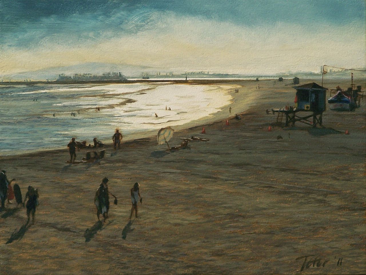
Urban Seascape 2


"Seal Beach 2"    SOLD
oil on panel, 2011
6" x 8" (15.24cm x 20.32cm)

Seal Beach is quietly tucked between the two more well known Long Beach and Huntington Beach. Long Beach known for it's Grand Prix race every year and Huntington Beach, a major surf town, for it's surfing competitions.
This is the second painting of Seal Beach and is a variation of the first, "Seal Beach" click here. The first focused more on the water, this one features the sand more prominently.
Both are of the same time of day. A hazy, warm summer day, late afternoon. Silvery surf and bronze sand set against the backdrop of the LA Harbor. Visible are the harbor cranes, an oil drilling island, downtown Long Beach and the Palos Verdes Peninsula in the distance.
The beach is fairly empty after some kind of event earlier in the day and a few of it's remaining denizens lazily head for home.119

Click on image for larger view